Just been playing around with some of the layouts for the text in the animation.
Think i'm just going to have the animation very heavily text based and use the movement of the text as the main feature.
Here are some of the layouts i've been playing with:
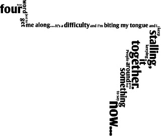 This first image, is of the first verse of the song. I want to have the camera effect pan across the multi-directional words as they appear in the frame in time to the music.

Just a little layout of the song title, not sure if i'll have enough time to get to the chorus of the song, so I'll have to wait and see.
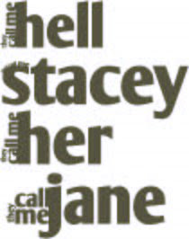
This image is for the second verse, which has very truncated, stacatoed text and rhythm. I want to have the repeated text 'they call me' growing out of the sides of the 'names'.
Just some rough ideas for the layout. Still needs some thought.
Think i'm just going to have the animation very heavily text based and use the movement of the text as the main feature.
Here are some of the layouts i've been playing with:
 This first image, is of the first verse of the song. I want to have the camera effect pan across the multi-directional words as they appear in the frame in time to the music.
Just a little layout of the song title, not sure if i'll have enough time to get to the chorus of the song, so I'll have to wait and see.

This image is for the second verse, which has very truncated, stacatoed text and rhythm. I want to have the repeated text 'they call me' growing out of the sides of the 'names'.
Just some rough ideas for the layout. Still needs some thought.
No comments:
Post a Comment