Here's my final animation.
After alot of frustraion and angst and wanting to throw my computer out of my 16 storey window, I've settled for this. I don't think I'll be able to do much better.
Phew!! All done!
Friday, October 24, 2008
Friday, October 17, 2008
Brief 4 | Examples
Here are some more sourced videos I've found off Youtube that I really like.
Really like the spotlighting in this last video. Going to try to attempt something like that. Looks good.
Really like the spotlighting in this last video. Going to try to attempt something like that. Looks good.
Wednesday, October 15, 2008
Brief 4 | More concept ideas
Here are just some images that i've found of the band's album art which I want to adapt into the concept for my animation.
Saturday, October 11, 2008
Brief 4 | Text Layouts
Just been playing around with some of the layouts for the text in the animation.
Think i'm just going to have the animation very heavily text based and use the movement of the text as the main feature.
Here are some of the layouts i've been playing with:
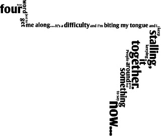 This first image, is of the first verse of the song. I want to have the camera effect pan across the multi-directional words as they appear in the frame in time to the music.

Just a little layout of the song title, not sure if i'll have enough time to get to the chorus of the song, so I'll have to wait and see.
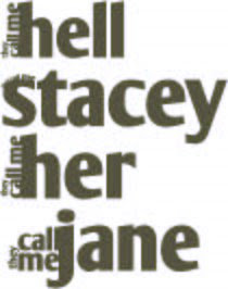
This image is for the second verse, which has very truncated, stacatoed text and rhythm. I want to have the repeated text 'they call me' growing out of the sides of the 'names'.
Just some rough ideas for the layout. Still needs some thought.
Think i'm just going to have the animation very heavily text based and use the movement of the text as the main feature.
Here are some of the layouts i've been playing with:
 This first image, is of the first verse of the song. I want to have the camera effect pan across the multi-directional words as they appear in the frame in time to the music.
Just a little layout of the song title, not sure if i'll have enough time to get to the chorus of the song, so I'll have to wait and see.

This image is for the second verse, which has very truncated, stacatoed text and rhythm. I want to have the repeated text 'they call me' growing out of the sides of the 'names'.
Just some rough ideas for the layout. Still needs some thought.
Wednesday, October 8, 2008
Brief 4 | Motion Text Animation
With this brief I really want to do something a bit retro and funky. Have a bit of fun with it.
I think I'll probably use the song,
"That's not my name" by the Ting Ting's
It's got a really great beat that i'm hoping will be slightly easier to sync the text too. Hopefully.
I think I'll probably use the song,
"That's not my name" by the Ting Ting's
It's got a really great beat that i'm hoping will be slightly easier to sync the text too. Hopefully.
Friday, September 26, 2008
Brief 3 | Aftereffects Animation Final
Rather sad in comparison with the others, but its my first time using Aftereffects, and i've learnt alot from this.
Monday, September 15, 2008
Brief 3 | Research
Here's some more videos I really liked:
Love, love, love the ink on parchment look!
This one is one of my favourites!
Love, love, love the ink on parchment look!
This one is one of my favourites!
Wednesday, September 10, 2008
Brief 3 | Aftereffects Animation
With this animation I'm not quite sure how I want to do it yet.
I'm thinking of showing a progression of time, through water and it's proverbial 'life-cycle'.
Really love some of these videos that I found on youtube.
Absolutely love the affect created, I know I won't be able to do anything even remotely close, but the idea is there :)
I'm thinking of showing a progression of time, through water and it's proverbial 'life-cycle'.
Really love some of these videos that I found on youtube.
Absolutely love the affect created, I know I won't be able to do anything even remotely close, but the idea is there :)
Tuesday, September 2, 2008
Sunday, August 24, 2008
Wednesday, August 20, 2008
Brief 2 | Progress
Have been looking at Photoshop tutorials online, and found one on Worth1000 that I found particularly helpful. This one is about digitally creating hair, which of course is incredibly applicable when trying to create a doll.
 Really learnt alot with this one. Has a really realistic finished product too!

Sunday, August 17, 2008
Brief 2 | Changing concepts
Due to the lack of quality images, I have decided to change to the Celebrity dolls concept. I believe that this brief will allow for me to play more towards my strengths and learn a little more about precision in Photoshop.
The image that i'm choosing to change is of beautiful Andy Whitfield, a model/actor.
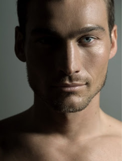
The image that i'm choosing to change is of beautiful Andy Whitfield, a model/actor.

Tuesday, August 12, 2008
Brief 2 | Visual Fiction
With this brief I found myself torn between several of the themes available on Worth1000.com
I couldn't decide between the 'Mate a movie', 'Out of place' and 'Celebrity dolls' contests.
At the start I chose the Mate a movie concept and was attempting to merge Wall-E with X-files, to create the E-files. Unfortunately due to a lack of being able to source images of a high enough quality to create a passable meld, I made the decision to choose another concept.

I didn't have a problem finding decent sized images of Wall-E, the X-files was a little more difficult however, only managing to find images that were about 600x600pixels, which weren't sufficient enough.
I couldn't decide between the 'Mate a movie', 'Out of place' and 'Celebrity dolls' contests.
At the start I chose the Mate a movie concept and was attempting to merge Wall-E with X-files, to create the E-files. Unfortunately due to a lack of being able to source images of a high enough quality to create a passable meld, I made the decision to choose another concept.

I didn't have a problem finding decent sized images of Wall-E, the X-files was a little more difficult however, only managing to find images that were about 600x600pixels, which weren't sufficient enough.
Monday, August 4, 2008
Subscribe to:
Comments (Atom)


